Progressive Enhancement Techniques Boosting Accessibility in Data Visualization Dashboards for Scientific Communities
Progressive enhancement starts with a functional baseline that works across all devices and user capabilities then layers additional features for browsers and assistive technologies that support them. In scientific data visualization dashboards this approach ensures that core data remains available through text descriptions and basic tables while advanced interactive charts appear only when conditions allow. Researchers who rely on screen readers or keyboard navigation gain consistent access to datasets without depending on JavaScript-heavy graphics that may fail in certain environments.
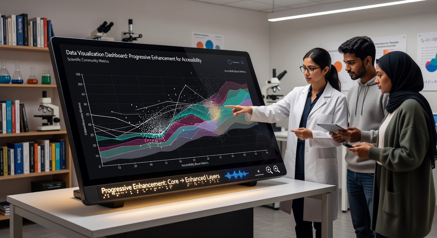
Core Principles Applied to Scientific Dashboards
Teams build dashboards by first delivering semantic HTML structures that include data tables and descriptive headings. These elements provide immediate access to raw values from experiments such as climate measurements or genomic sequences. Once the baseline loads developers add CSS for visual styling and then JavaScript for features like zooming or filtering. The result is a system where users without modern capabilities still retrieve essential information while those with advanced browsers receive enhanced interactivity.
According to guidelines from the World Wide Web Consortium developers assign ARIA roles to chart elements so assistive technologies can announce data points in sequence. This layering keeps the experience intact even when scripts are disabled or when network conditions limit resource loading.
Techniques That Support Accessibility Layers
One common method involves creating fallback content that mirrors visual elements through structured lists and summaries. For instance a line chart showing temperature trends over decades begins as an ordered list of yearly averages paired with explanatory text. When JavaScript activates the list transforms into an SVG visualization complete with tooltips and color scales that meet contrast requirements.
Another technique uses media queries and feature detection to deliver different interaction models. Touch devices receive larger hit areas on data points while desktop users gain hover states and keyboard shortcuts. Observers note that this detection happens client-side so the same server response serves both simple and complex interfaces without duplication of effort.
Integration with Existing Scientific Platforms
Many research institutions already host dashboards on platforms that process large datasets from particle accelerators or satellite imagery. Progressive enhancement fits into these workflows by wrapping existing visualization libraries with wrapper functions that test for support before rendering. Data from May 2026 reports by the National Science Foundation indicate increased adoption of these wrappers in collaborative portals used by multi-institution teams studying biodiversity patterns.

Keyboard navigation receives special attention through focus management scripts that move users sequentially through data series. When a user activates a control the system updates both the visual display and an associated live region that screen readers monitor for changes. This dual update prevents loss of context during exploration of complex multivariate datasets.
Benefits Observed Across Research Fields
Studies conducted by European research consortia show that dashboards built with progressive enhancement reduce support requests from users who employ assistive technologies. The baseline HTML ensures compliance with standards while enhancements improve efficiency for sighted analysts who perform rapid comparisons. In fields such as astrophysics where teams review time-series data from telescopes this consistency speeds up validation processes across distributed groups.
What's interesting is how the method aligns with open data mandates from agencies in Canada and Australia. Those policies require public datasets to remain usable regardless of viewer software. Progressive layers satisfy these rules by keeping text equivalents always present while offering richer views to equipped users.
Implementation Patterns in Practice
Development teams often begin with data export functions that generate both CSV files and visual canvases from the same source. Feature detection then decides whether to attach event listeners for brushing and linking between multiple charts. This pattern appears in dashboards maintained by university bioinformatics centers where genomic variant data must remain readable by both automated pipelines and human reviewers.
Turns out that caching strategies play a supporting role because enhanced features load only after core content appears. Service workers can store the baseline markup locally while deferring larger script bundles until bandwidth permits. The approach keeps initial load times low for remote field researchers who access dashboards over limited connections.
Conclusion
Progressive enhancement continues to shape how scientific communities share and interpret complex datasets through dashboards. By establishing accessible foundations first and adding capabilities conditionally the method delivers reliable experiences across varied user needs and technical conditions. Data from multiple regions confirms growing integration of these practices in platforms handling everything from environmental monitoring to molecular modeling. The result is broader participation in research analysis without compromising the depth of visual exploration available to those with compatible tools.